New Away Kit for Next Season?
I was wondering why we have a red away kit, when that colour is not normally associated with the club or the town.
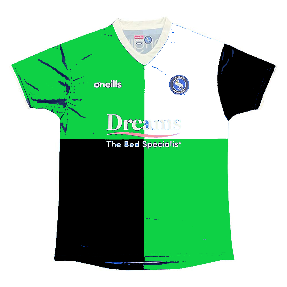
If you look at the official town crest as displayed on the town hall, it is a white swan on a green field, with a black night sky background. So why not use those colours for the away shirt, while keeping the traditional quarters?
Here's what it might look like. With black shorts, green socks with white tops, looks smart. What do others think?
-6


Comments
Trolling again Mr Bargepole, they are the colours of the lumps that follow the egg down at Kingsmead.
If you care to know anything about the Wanderers history, our change kit for many years was Red and white, as worn at Wembley in 57. I preferred the change kit of pale yellow and blue that was used in the 70's and 80's.
The towns Football, Cricket, Hockey teams all wear light and dark blue.
I'm surpised as a self confessed rugger fan, you didn't follow HWRFC, rather than jump on the London Parasites bandwagon when it rolled into town.
I think it’s a bit too much. Without the black and a subtler shade of green it would look OK.
Make the white quarter black and I think it's alright. I'm just personally not a fan of green kits.
Certainly not trolling, it's meant to be a genuine suggestion.
Yes I know High Wycombe RUFC have those colours, I played for them for many years, before I got too old, fat and slow. That was after I played for Wasps in the 60s and 70s, and later followed them to Loftus Road and then Adams Park.
But none of that is a reason to reject my suggested design out of hand, and I think it looks more 'Wycombe' than the red kit.
I thought Fat and Slow were the necessary qualities needed in a Rugger player along with the ability to sing vulgar songs and drink their own wee.
I know many football fans regard green as 'unlucky'. But Plymouth Argyle haven't done too badly, nor Celtic for that matter.
Why do we have an all red kit?
Pete C is a Liverpool fan.
Go figure.
If it was down to me it would be either all white with light blue trims or all yellow with light blue trims... I'm not a massive fan of red kits I must admit
Decent effort at something to properly rival the "Smith" kit as our worst ever.
Think we have Big Roy Essandoh to thank for making red a Wycombe kit colour.
I quite liked the Ukraine kit that we wore as a one off game last season
that shade of green is yuk, nearly Forest Green bad.
I think black and white quarters would be decent, or maybe (darker) green and white.
Did you not watch Wasps at Sudbury?
I've always liked the idea of greyscale quarters
When they were at Sudbury, I used to play school rugby on Saturday mornings, then head down to Sudbury for afternoon home games.
Then when I left school, I joined the club as a player, starting in the Colts XV, and progressing to the dizzy heights of the 2nd XV during a flu epidemic. In those days, they used to put out a dozen or so sides every week, and it was all 'amateur' with people playing for fun.
But if you were a first team squad player, they got reasonable travelling expenses, and the better the player, the more reasonable the expenses became.
As the modern game has become much harder and faster (despite what @ChasHarps believes) there are now far fewer players participating in the game. At High Wycombe in the 1990s, we would have enough playing members to field 6 or 7 teams. Nowadays they can just about manage 3.
Interesting, played football and cricket next door at Sudbury Court many years ago.
Is the physicality the reason for the decline? Found this but not sure it says that overtly:
https://www.theguardian.com/sport/2022/jan/11/does-the-future-look-bleak-for-recreational-rugby-union-in-england-breakdown
Aren’t we due new kits next season for both home and change, dependant on whether we move away from O’Neills or not.
This is the first year of the home kit isn't it?
Yeah, I think it's another two-year job.
I usually get a home kit, but the last one had a year behind closed doors in there, and this one just seemed a bit too samey. So am still milking the value of the gold away one. Having been to about 8-10 games since it came in, and the team only wearing it once!
Blimey, something written in The Guardian that I actually agree with! That's a first.
That is a stunningly bad kit and I want one.
The first WWFC change kit I saw was red shirt, white shorts, red socks. With a light blue number. Same as they played at Wembley in '57, except that this was in the early 70s. Like @ChasHarps, however, I favour the yellow/light blue from the late 70s and 80s.
Last time we dabbled with the green, white and black was the inaugural season in the EFL. Didn't work for me... Made for a very surreal opening game at Carlisle...
Unsubtle piece of bear-poking there, @bargepole Have a read of this, I think you'll like it...
https://www.theguardian.com/politics/2023/feb/09/bring-back-hanging-and-real-men-making-the-tories-great-again-by-lee-anderson
As someone who doesn't wear footie shirts all I would say is our change strip should ideally be a quartered design (red & white works, as does blue & yellow, or dark green & white) & our third strip can be any colour so long as it isnt wet sand...
I would give this ten likes if I could. Playing in quarters as much as possible would be great!
I actually really like the current design. The white is judiciously placed to make the whole look quite sleek and classy. As others have said, white shorts would be a nice option (and light blue too).
The "wet sand" kit referenced by @Erroll_Sims feels like a mistake admitted by the club, as we have made no effort to wear it at all this season if I am correct?
It's not still in our kit rotation, is it?
With your ska credentials, what about black and white quarters?
Coventry had a 2 Tone kit
My preference order for away kits is:
1) Something in quarters
2) All white with dark blue trim. We came very close to this in the early 2000s IIRC
3) Something so garish and awful that people all over the world are bidding for it on eBay.